A car’s dashboard has several displays built into it that tell us how many kilometers we have driven or how much gas is left in the tank. An OKR dashboard works similarly: it actively shows how much progress has been made and what the current status of the OKRs is. This gives companies a transparent overview of the status of their OKRs at all times.
This article explains what an OKR dashboard is, how it is structured, and why you need an OKR dashboard.
What to expect:
- What is an OKR dashboard?
- Why do you need OKR dashboards?
- What should an OKR dashboard include?
- How is an ideal OKR dashboard structured?
- Creating the dashboard: Use templates or software
- OKR dashboard: FAQ
What is an OKR dashboard?
An OKR dashboard is a tool that visualizes all the important data regarding a team’s or company’s OKRs at a glance. It summarizes the status of the OKRs in a visually appealing way, while also breaking down Objectives, Key Results, and Initiatives. In some cases, it also provides real-time updates. This makes it an important component of OKR reporting.
The OKR dashboard should always be positioned in such a way that the entire team has access to it. It should be easily visible and always present in everyday work – whether analog on the office’s whiteboard or digital via OKR software (more on this later), a template, or the intranet.
💡 Note: OKR (short for “Objectives and Key Results”) is an agile framework for formulating and implementing strategic goals in companies that – if used correctly – leads to more flexibility, transparency, and success. It consists of three core elements:
- Objectives: What do I want to achieve?
- Key Results: How do I know that the goal has been reached?
- Initiatives: How do I achieve the goal?
A total of 2 to 4 Objectives per team and 2 to 4 Key Results per Objective are formulated. The output is mapped into initiatives (= concrete tasks ). More basic information is available in our OKR guide.
Why do you need OKR dashboards?
Above all, OKR dashboards create transparency. They make the OKRs, and their progress, clearly visible in one central location. A simple glance at the dashboard reveals which goals are on track and which need special attention. The dashboard thus provides direct feedback on whether one is getting closer to the set goals.
In addition, an OKR dashboard fulfills other important functions:
- It helps create an understanding of the strategic direction throughout the company while keeping everyone on the same page.
- It makes it easier to see how individual tasks contribute to overall goals.
- It serves as a starting point for further analysis, discussions, and new initiatives.
- It helps identify and resolve problems (e.g., missing assignments or attributes) with current goals more quickly.
What should an OKR dashboard include?
An OKR dashboard should contain at least the following elements:
- The team’s OKRs
- Confidence level
- Health metrics
It goes without saying that the OKRs should be included in the dashboard. The Objectives should be highly visible and prominently placed on the dashboard. Beneath them, the progress for each Key Result is displayed. Various graphical representations can be used for this, such as trend lines, Andon charts, or bar graphs. It is best to keep the layout of the display as simple as possible. The current confidence level (also called confidence score) for all contributing Key Results should also be displayed in the OKR dashboard. Scores should always be updated for the weekly OKR check-in.
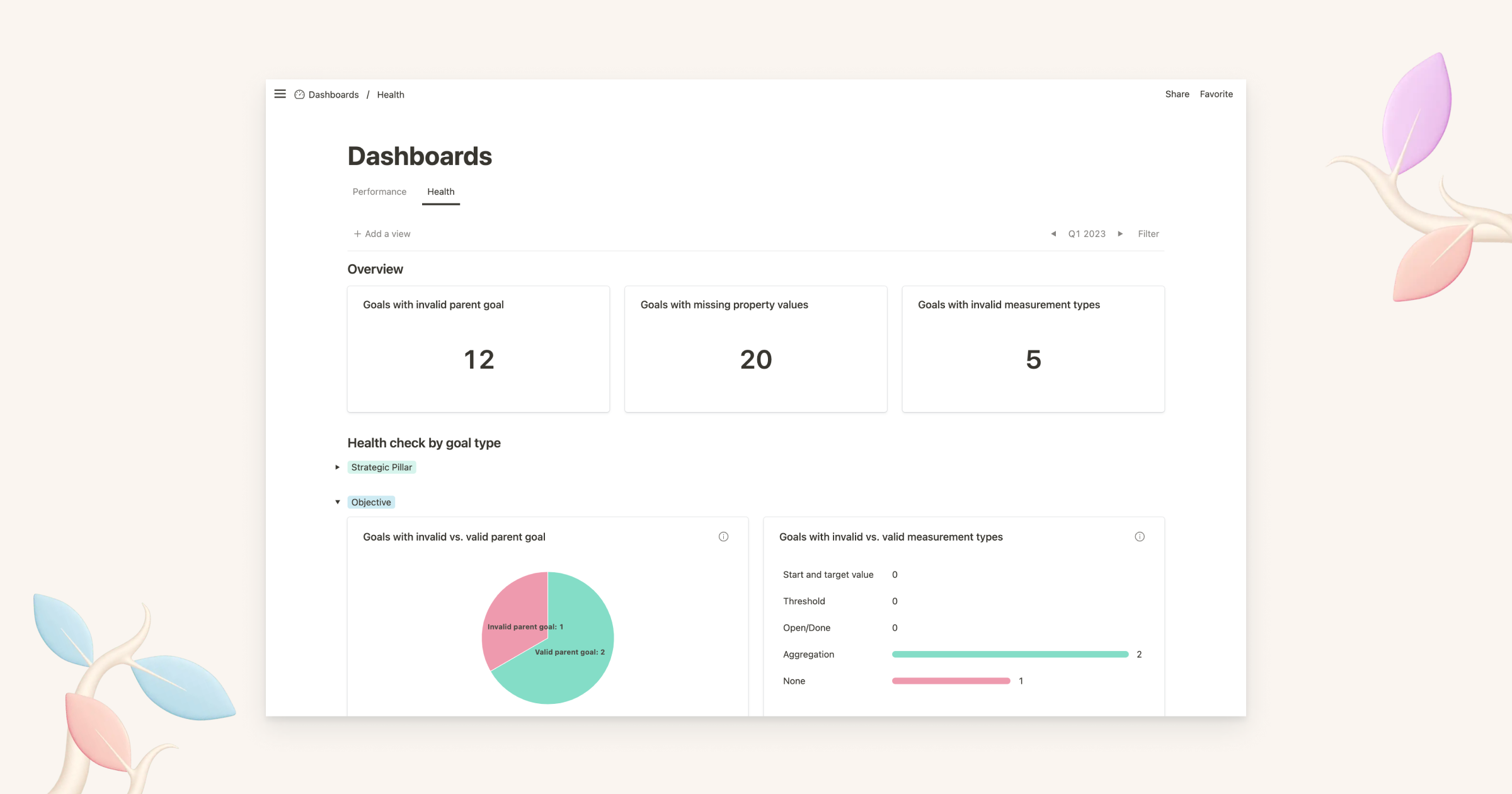
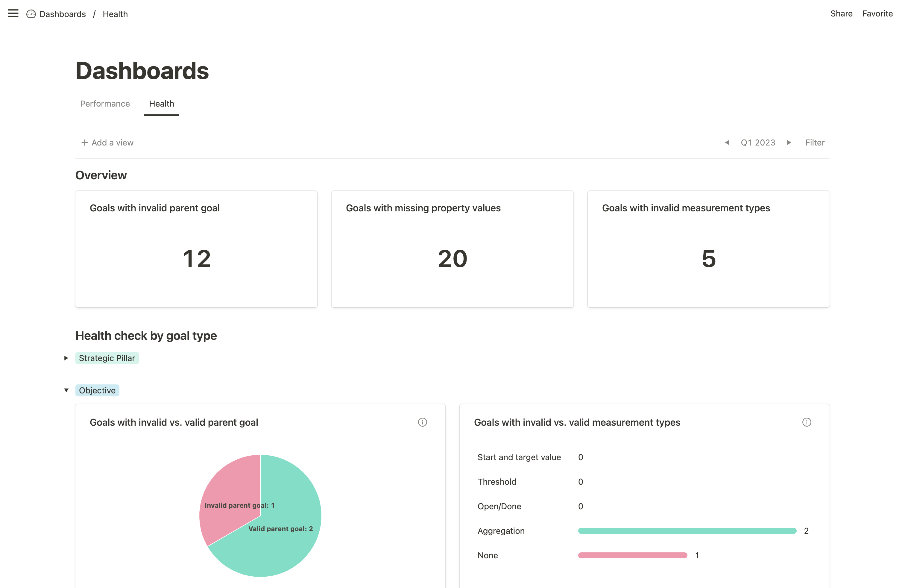
Ongoing health and quality checks for all targets help ensure that the entire OKR process runs smoothly. The dashboard should therefore indicate which targets still have problems, e.g. invalid parent objectives, missing property values, or invalid measurement types.
What is the structure of an ideal OKR dashboard?
An ideal OKR dashboard is visually designed in a way that it’s easy to understand. It should also motivate employees to work with it repeatedly. To do this, it has to meet two requirements:
- The information should always be up-to-date and accurate.
- All data should be presented graphically in a visibly appealing way.
Information
The OKR dashboard should ideally be updated repeatedly – at least weekly for OKR check-ins – or automatically. The data must be up to date before the check-in begins to avoid prolonging the meeting unnecessarily. In such cases, the dashboard will not add value and focus will be lost as progress is updated during the meeting.
Additionally, information in the dashboard should be relevant and motivate the team. For this, the Key Results should be directly measurable and controllable. So-called leading indicators, whose progress is visible immediately or only with a short delay, are needed. This must therefore be set during the OKR planning.
Design elements and gamification
However, relevant and up-to-date information alone does not ensure that people enjoy working with the dashboard on a weekly or even daily basis. The figures must also be presented in a visually appealing and, above all, intuitive way. Elements from game design are well suited for this. Empirical studies have shown that gamification – the use of playful elements in a non-game context, for example at work – increases motivation.
Typical elements that can also be applied to OKR dashboards are:
- Leaderboards: A visual ranking can motivate team members to contribute as much as possible to OKRs and complete assigned tasks on time.
- Points: A scoring system (e.g., confidence score during and final OKR scoring at the end of the cycle) makes progress visible and provides additional feedback.
- Badges: Badges can make positive feedback and good performance visible. They can also help ensure that all employees update their OKRs: For example, a badge could be awarded whenever someone updates their OKRs three times in a row a day before the check-in. Whoever collects the most of these badges wins a nice little surprise at the end of the cycle.
- Performance graphs: Graphs showing success (or failure) in terms of OKRs can provide information on how a team or company performed in the current OKR cycle compared to the previous one.
- Avatars: Avatars, visual representations of people, can help employees get a sense of purpose as they feel more accountable and connected to the OKRs.
- Teams: Being responsible for specific OKRs as a team encourages collaboration, competition, and new ideas among the teammates.
Creating the dashboard: Use templates or software
OKR dashboards can be kept analog, for example on a flip chart or a wall. This way, they are both present and accessible in the office. Teams can discuss them and include playful elements to individualize their board. However, in the light of working from home, a digital dashboard – which offers the same possibilities – is more contemporary and easier to maintain.
The best way to create and maintain such a digital OKR dashboard is within an OKR software. Being able to design the dashboard in an interesting way and leaving enough room for customization is essential. Mooncamp, for example, offers different dashboards, e.g. the Progress Dashboard and the Health Dashboard.
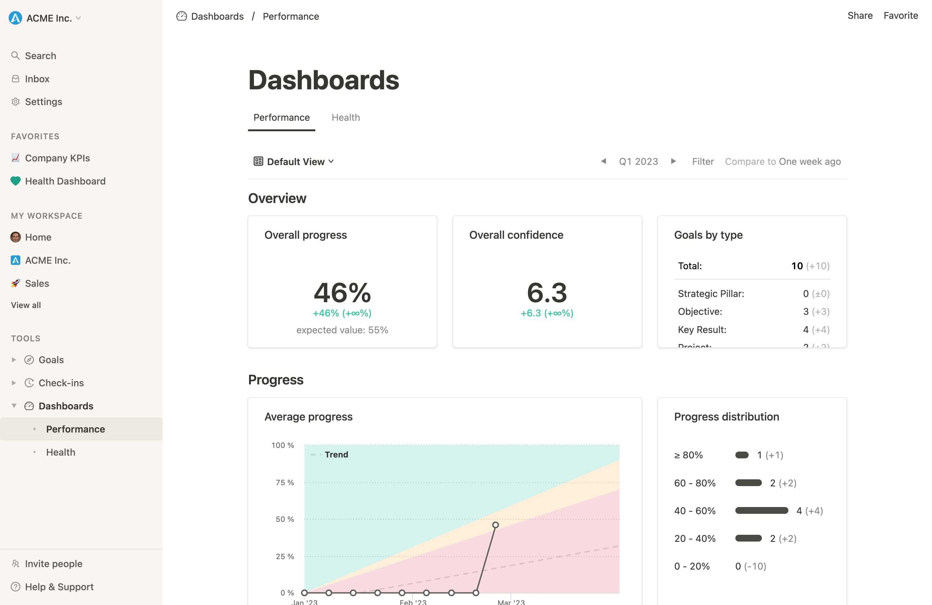
- The Progress Dashboard provides detailed insights on the progress of all goals, grouped by a team or employee. It shows the overall progress as well as information about which goals have not yet been updated or are at risk.
- The Health Dashboard provides an overview of the health and quality of all OKRs. It ensures that the entire OKR process is running smoothly and reveals whether everyone is adhering to the agreed-upon OKR rules.
Properly implemented, an OKR dashboard within an OKR software has several advantages:
- All information about the OKR process is visible in one place.
- The dashboard’s data is automatically synchronized and can be accessed in real-time.
- All data can be evaluated in detail. The findings are then used to further improve the process.
- By means of integrations, data from other sources can also be included in the dashboard.
However, in the beginning (or for small teams) simple OKR templates can also suffice. Many OKR tracking templates include tracking sheets for company-level OKRs and team OKRs, as well as an OKR dashboard that summarizes all progress.
OKR dashboard: FAQ
How to track OKRs?
OKRs are best tracked using OKR software. This involves collecting information about the progress of OKRs and entering it into the software. This can be done either manually or automatically via integrations. The progress can then be visualized in dashboards.
How to create OKRs?
OKRs are created in the OKR planning for one cycle at a time (usually three to four months). Planning is done on several levels: for the entire company, departments, and individual teams. Good OKRs are formulated in an understandable and transparent way. Objectives are inspiring and qualitative, while Key Results are measurable, specific, and time-bound.